========.title
# Tab Atkins- Bittner
* @tabatkins.com on BlueSky
* @tabatkins on Twitter
* https://tabatkins.com/talks/2024-06-07
=========
# Anchor Positioning
* A new ability added to absolute positioning
* https://drafts.csswg.org/css-anchor-position/
* Builds on existing absolute positioning, so we'll revisit that
=========
# History
* 2020: First draft written by Melanie Richards (Microsoft) and other MS engineers, as part of a proposal for popup dialogs (now the `popover` feature)
* Apr 2022: I adapted it into a CSS spec in my personal repository
* Sep 2022: Adopted as an Editors' Draft in the CSSWG repository
* June 2023: Substantial rewrite in collab with fantasai
=======
# Important Disclaimer
* I usually talk about things that don't even have experimental implementations
* Shipping in Chrome 125, but changes in 126, 127, 128...
* Can't use in prod until other browsers ship anyway
* So beware, things *will* break, and even my slides might be outdated next week.
========.title
# Part 1
# How Positioning Actually Works
=========
# CSS2 Positioning Model
* `position` has five values
* `static` does nothing (normal layout)
* `relative` and `sticky` do very little (normal layout + shifting)
* `absolute` and `fixed` activate "absolute positioning"
* Only difference between the two is the containing block used
========
# Containing Blocks
* CB for short
* Not an element, just a rectangle somewhere in the document.
* Generated by an element, and we say it "has properties" for shortness/clarity, which refers to the generating element
=============
# Abspos CB
* For abspos, CB is generated by the nearest ancestor that has non-`static` position
* Or any of a decent-length list of other properties, which need to "group" or "scope" children for some paint-related reason: `transform`, `opacity`, `contain`, etc (not `overflow`, tho!)
* If no element qualifies, uses the "initial containing block" (ICB), which is the size of the screen and positioned at the top of the document
========
# Fixpos CB
* For fixpos, `position` doesn't matter, but most of the additional properties still generate CBs
* If no element qualifies, uses the viewport itself (size of the viewport, moves as you scroll to stay view-filling)
* ("What's the viewport on mobile?" Great question, now largely answered due to Bramus's efforts)
========
# CB Modifications
* Grid can do some magic here
* If the CB-generator is a grid container, and abspos has grid-positioning properties (`grid-column`, `grid-row`, etc), the CB is changed to the specified grid area
========
# Next, Insets
* `top`/`left`/`right`/`bottom`
* `inset` shorthand, widely supported but still not widely used
* `inset-block-start`/etc logical longhands, when needed
* How they actually work is a bit complicated. There are three cases, and it works independently in each axis.
==========
# both auto insets
* "anchored" to "static" "position"
* COMPLICATED, varies by layout mode, mostly useless in new layout modes
* Best used for inlines; abspos "leaves behind an anchor"
* Very limited in how it can be used - always start/start aligned to the anchor, basically
=======.side-by-side
Here is some text.absposHere's text after it.
========
# one auto inset
* Designed to let you pretend it's explicitly positioning an edge
* Content-sizes the element, computes the `auto` inset to exactly what fills the CB
=========.side-by-side
abspos
========
# no auto insets
* "inset-modified containing block" or IMCB
* shrinks the CB rectangle (or grows it, if negative)
* in CSS2, needed to pair with `auto` width/height/margins; otherwise it acted like "one `auto`" instead
* in CSS3, that's behavior of `justify/align-self:normal`; other values align the sized abspos within the IMCB
==========
* All this `auto` behavior somewhat a "legacy" behavior. new properties ignore/change it
* Self-alignment props change the behavior of "everything non-`auto`", distributing the extra space as alignment
* If you actually use `auto`, tho, most of the alignment values still don't do anything useful, for legacy reasons
* Anchor positioning props change the auto behavior *entirely* to just turn to 0, no static position at all.
===========
* And that's abspos, a lot of details packed into a few properties
Figure out your containing block
Adjust it to produce your IMCB
Align yourself within that IMCB
==========.title
# Part 2
# Anchor Positioning
=================
# The Anchor Element
* `anchor-name: --foo` gives an element a name
* `position-anchor: --foo;` makes it your default anchor
=========
# Anchor Visibility
* Only anchors within your containing block are "visible"
* If multiple elements are visible with the same name, the last one is used.
* `anchor-scope: --foo` scopes a name to a subtree, making it less visible
=========.side-by-side
abspos
========
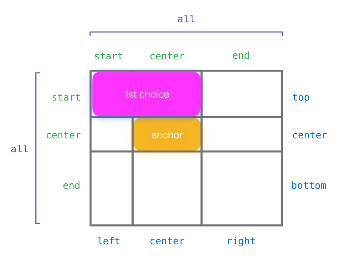
# Basic Usage
`top span-left`
* `inset-area` positions the abspos relative to the default anchor
* Grammar is somewhat similar to `background-position`: specify one or both axises
One track: `top` / `center` / `bottom`
Two tracks: `span-top` / `span-bottom`
Three tracks: `all`
=======
# inset-area Effects
* Containing block is set to the specified area
* `auto` insets resolve to 0
* `normal` self-alignment resolves to "the obvious one"
* Also, multiple sets of axis keywords exist, for logical directions
`block-start span-inline-end`, etc
`x-start span-y-end`, etc
`start span-end`, etc
=======
# anchor-center Alignment
* A new self-alignment (`align/justify-self`) value: `anchor-center`
* Makes the element center itself over the anchor, in the specified axis,
rather than centering in the containing block
=======.side-by-side
abspos
=======
# anchor() function
* Only usable in the inset properties (`top`, etc)
* Resolves to the length needed to set that inset to match that anchor edge
* Can be used in `calc()` to do more complex things.
* `anchor( [ <anchor-name>? && <anchor-side> ], <fallback-length> )`
======.side-by-side
==========.side-by-side
Here's a bunch of text and then some more text following text.
comment about the first word
comment about the second word
comment about the third word
========
# anchor-size() function
* Similar to `anchor()`, but usable in more properties
* `anchor-size( <anchor-name> || <anchor-size>, <fallback-value> )`
* Might expose more sizes in the future.
========
# Scrolling Limitations
* Scrolling is done in a separate process ("the compositor") for speed and reliability
* Getting info from the compositor back into layout takes time, and might be stale
* Only way to stay in perfect sync with something on the compositor, is to also be on the compositor
* This limits what we can do in response to scrolling - NO LAYOUT
* You won't notice this 95% of the time, but when it does matter it's very confusing if you don't know what's going on.
=========
# Transforms Limitations
* Also often animated on the compositor, so similar issue
* Can also make the concept of "left edge" complex - what if rotated? Skewed?
* For now, just ignores trasforms entirely.
* Might let you opt into following the bounding box, with potential for desync.
==========
# Handling Overflow
* "Put me here if there's room, otherwise over there"
* Based on overflowing the IMCB (inset-modified containing block)
* `position-try-options: <'inset-area'> | flip-* | <try-block-name>`
==========
# position-try-options <inset-area>
* Just a new `inset-area` to use
* Nothing special here
* `inset-area: top; position-try-options: bottom;`
==========
# position-try-options flip-*
* Flips the relevant properties: insets, margins, sizes, inset-area, alignment
* `flip-block`, `flip-inline`, `flip-start`
* Can be combined: `position-try-options: flip-block flip-inline;`
=======.side-by-side
Here's some preceding text, followed by a floating list of reasons.
one
two
three
four
five
six
=========
# @position-try
* New at-rule, takes a set of properties you want to override
* Previous options actually defined in terms of this, but you can use it directly for flexibility.
* `inset`, `margin`, `width`/`height`, `inset-area`, `align-`/`justify-self`, `position-anchor`
=======.side-by-side
Here's some preceding text, followed by a floating list of reasons.
one
two
three
four
five
six
=========
# Ordering Fallbacks
* If you don't have a preferred order for your fallbacks, but just want "the best one"
* Reorders your fallback list (and base styles) based on the containing block size available.
=======.side-by-side
Here's some preceding text, followed by a floating list of reasons.
one
two
three
four
=========
# Interactions with Scrolling
* Positioning needs to stay exactly flush; switching around has more tolerance.
* Still only adjusts for default anchor, but correctly computes containing block size for overflow calculations.
=========
# Just Hide It
* What if your popup isn't very important, so if it doesn't fit, just don't bother displaying it?
* `position-visibility: no-overflow`
* What if your anchor is in a scroller? You don't want your popup visible when the anchor isn't.
* `position-visibility: anchors-visible`
=======.side-by-side
Here's a whole bunch of preceding text, so things are scrollable at some point.
Here's a bunch of text and then some more text and some more text, so much text.
Here's a whole bunch of following text, so things are scrollable at some point.